DYNAMIC ARTWORKS
A beautiful SoundCloud
experience with
automated cover arts; where images, text and
filters can be tailored to
for different playlists and
users on the go.
Product Design
2023

WHAT ARE
DYNAMIC ARTWORKS?
With dynamically generated artworks, we refer to a backend system that can compile several different assets or data points (text, images, overlays, colours..) to a new image on request.
A layout is defined, but what images and titles to be used is defined elsewhere.
WHY DYNAMIC ARTWORKS?
Manually adding cover arts to playlists is time consuming and unfeasible for a large number of playlists. You can’t tailor the cover arts to individual users, translations gets cumbersome, and creativity get’s limited.
With automated cover arts, we can create branded, beautiful experiences, tailored to every user, with proper translations, that dynamically changes and updates over time. It enables us to systematically supply a large amount of playlists with nice covers, optimized to drive plays, which isn’t feasible today.
Artworks are the storefronts of our content, in a world that’s highly visual. We believe that wrapping and branding our experience will make users more inclined to listen to our playlists and give a facelift to the overall experience on home.
WHAT THE RESULT WILL BE?
A beautiful SoundCloud experience with automated cover arts; where images, text and filters can be tailored to for different playlists and users on the go.
We’re able to effortlessly a/b test and optimize cover art to drive plays.

HOW WE DID IT
FRAMING THE PROBLEM
The cover of the current playlist cannot clearly explain the content of the playlist.
More of what you like is a playlist that is automatically generated based on the most played songs or singers in the user's listening records. In the case of only displaying a song cover and song title, many users reported that this would mislead them into thinking this is just the playback entry for this particular song.
FINDING THE RIGHT DESIGN
We did some design exploration with the question of how to let users distinguish MoWYL from other sections of the homepage. Initial design exploration can be categorized into three types in the diagram below.
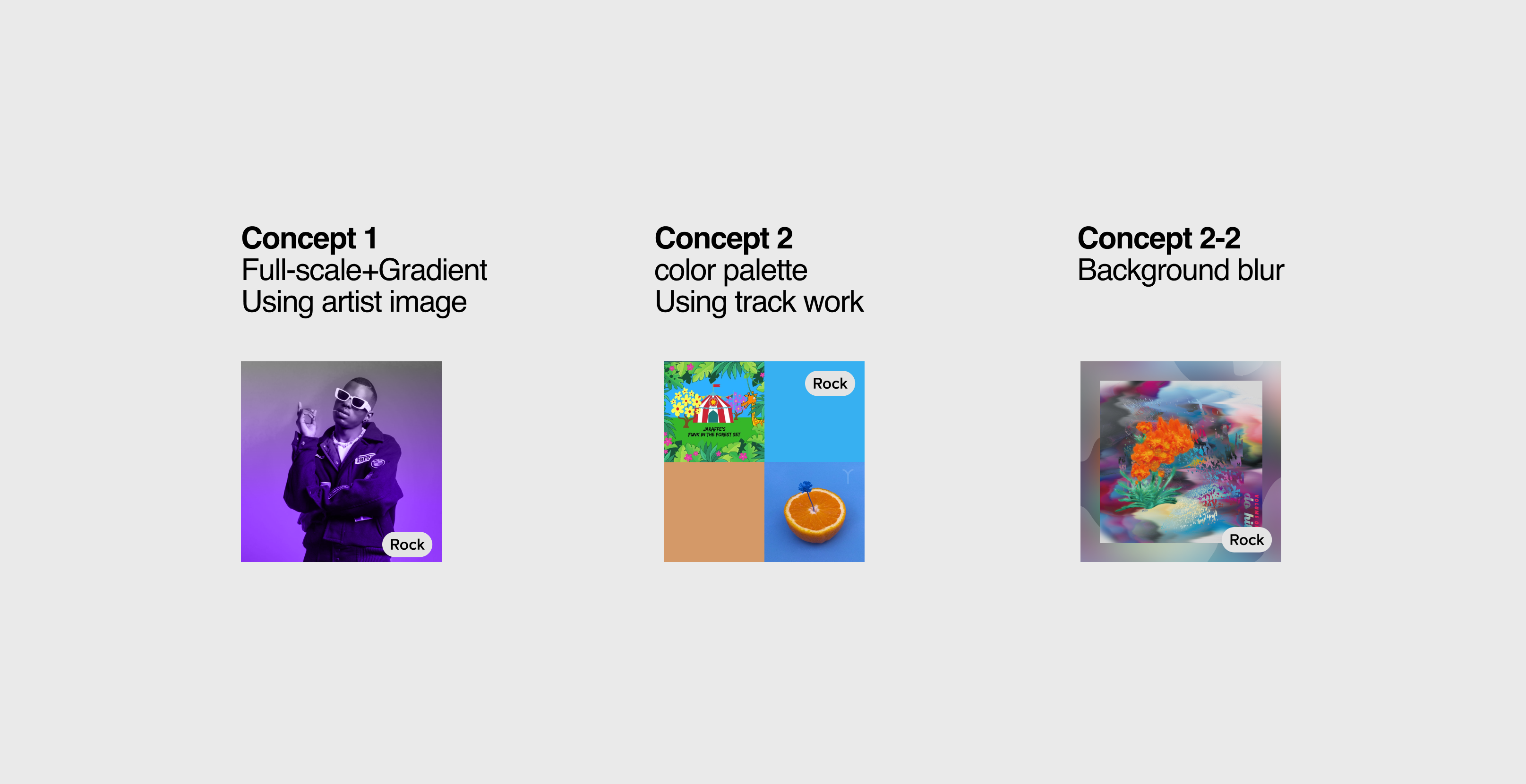
From this step, we decided to further improve the design of concept 2, and finally evolved into the two designs on the right.
The reasoning behind design direction 2 is as follows:
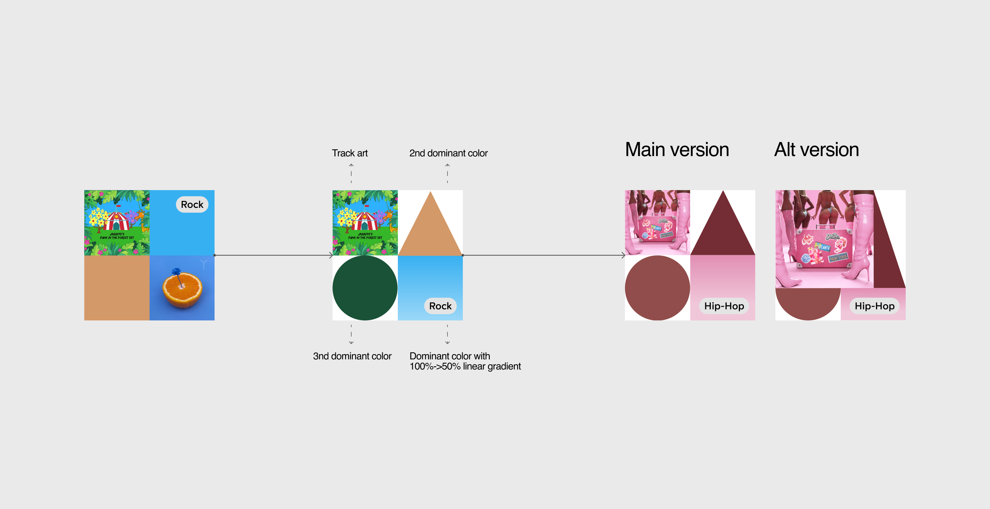
In the initial design, I included the cover of the original song and the cover of a second song, which were similar to the original song. The two remaining squares represent the main colors of these two covers. However, we encountered a problem where by having two song covers displayed simultaneously may confuse users, making it difficult to identify what this playlist extension is for. To solve this issue, I decided to reduce the embedded song cover to one. The three remaining color blocks represent the top three theme colors of this cover and signify "songs similar to this song." Additionally, shapes were introduced to symbolize the concept of "similar but different songs."
Unfortunately, a new problem arose when I combined four squares of the same size together. The original song's cover became very small and may not be recognizable on a mobile phone screen. Therefore, I created an alternative version that displays the cover of the original song more prominently while still accommodating the other three squares.
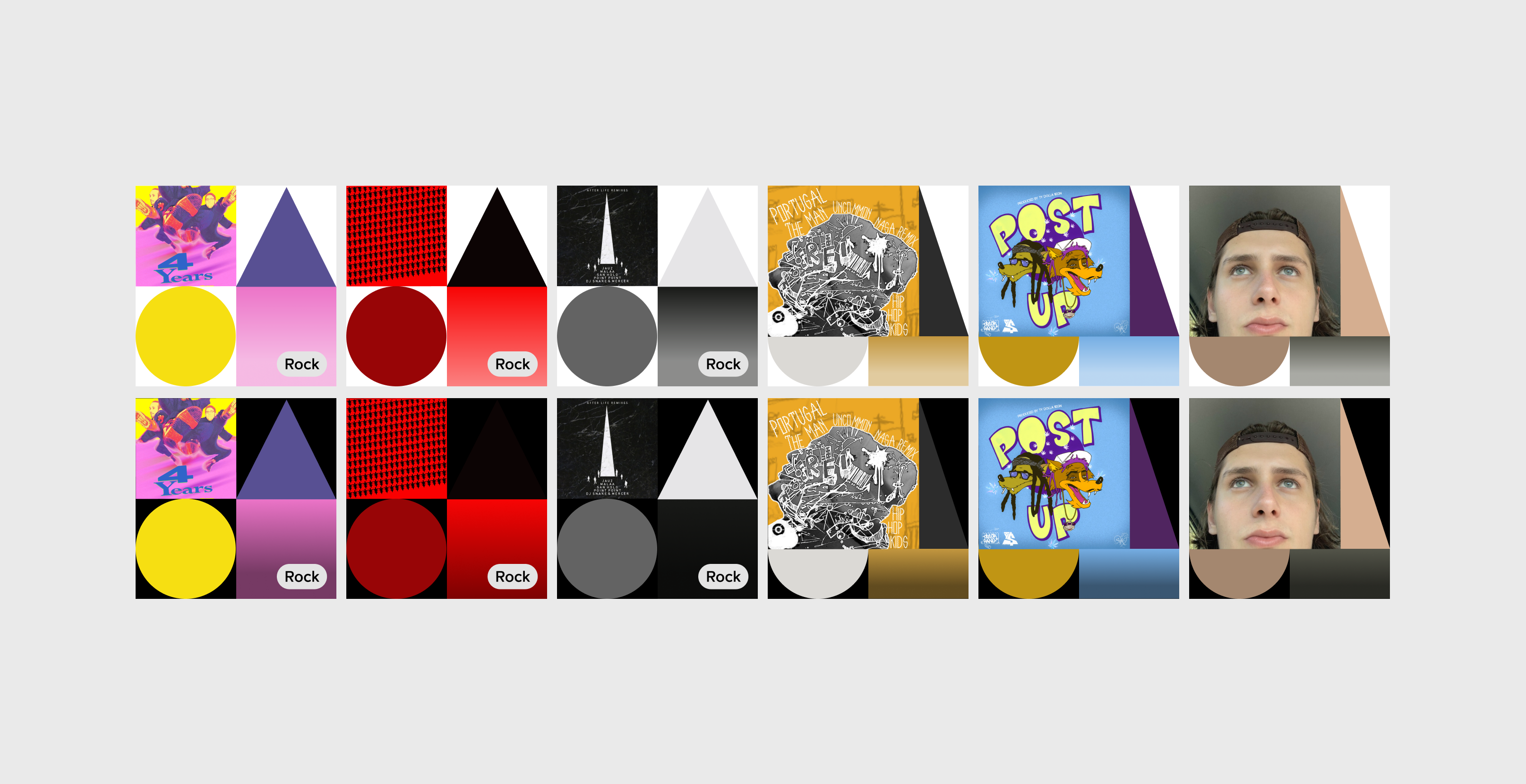
STRESS TESTING
Before delivering them for user testing, we did a round of color stress testing to ensure that the design can be applied to any cover art
USER TESTING
After running a preference test, we realized we had gained some interesting insights but needed to know more about how users interacted with the different modules.
For this reason, we decided to conduct 1:1 interviews with users to find out more about the reasons behind their preference for one design over another.
Here are some takeaways:
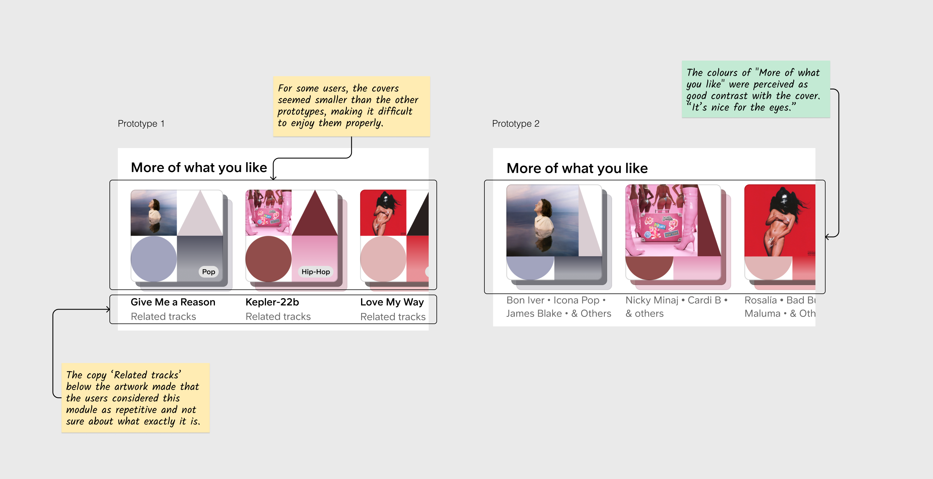
In general, users mentioned that the artworks in More of what you like allowed them to differentiate between a playlist and tracks/albums
WHAT’S NEXT
We are very happy that this design has received positive feedback from users in user testing, and we are looking forward to allowing all SC users to experience this new design on their homepage. This section has been updated on some users' homepages